Week 1: Implementing Recent News
This chapter focuses on implementing the 'Recent News' section of your website. We'll continue to refine our understanding of the Flexbox layout to effectively organize multiple news items. Additionally, we'll explore how relative and absolute positioning can be used to enhance the presentation of news articles.
In this chapter, you will learn
Recent News
Next comes the last section of the page: the news list. What is the first step, again? That's right, write the HTML. When writing HTML, we can roughly analyse which elements need to be marked with class. You don't need to be perfect at this stage.
Because when using CSS selectors later, if we find some elements that need special attention, we can always go back and add them on the tag.
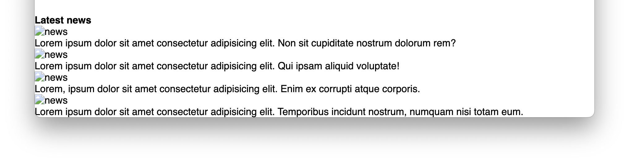
The news list is relatively straightforward, consisting of a title and four articles, each with an image and a text description.
<section class="latest-news">
  <h4>Latest news</h4>
  <ul class="news-container">
    <li class="news">
      <article>
        <header>
          <img src="assets/news-1.webpx" alt="news" />
        </header>
        <p>
          Lorem ipsum dolor sit amet consectetur adipisicing elit. Non sit
          cupiditate nostrum dolorum rem?
        </p>
      </article>
    </li>
    //...other items
  </ul>
</section>
Note the new tag we use here, article. article represents a standalone entity, such as a piece of news, a tweet, a blog, etc. When writing HTML, we also need to consider how to make the content semantic, meaning one can read the HTML code directly in the editor. Many web pages were filled with redundant and meaningless tags in the early days (and today as well). When we write a page, we need to consider the readability and maintainability from the very beginning.
Well, that doesn't look very appealing. Let's add some styles to it.
.latest-news {
width: 80%;
margin: 1rem auto;
}
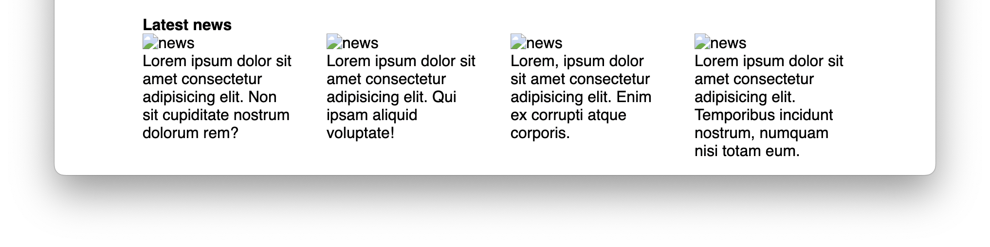
.news-container {
display: flex;
gap: 2rem;
}
.news {
flex: 1;
}After adding flex:1, the news lines up correctly:
Now let's find some real game covers to make it looks authentic.
Oops, the whole page seems to be messed up! But don't worry. You only need to specify the size of the image as a percentage so that the image will automatically scale to its container size:
.news img {
  width: 100%;
  border-radius: 1rem;
}
The picture scales correctly now:

In addition, we noticed that the font was too thick and larger than in the mockup, also the spacing between the title and the image was too close.
Let's fix it up:
.news p {
  font-size: 14px;
  font-weight: lighter;
}

h4 {
  margin: 1rem 0;
}
And now the final result is like:
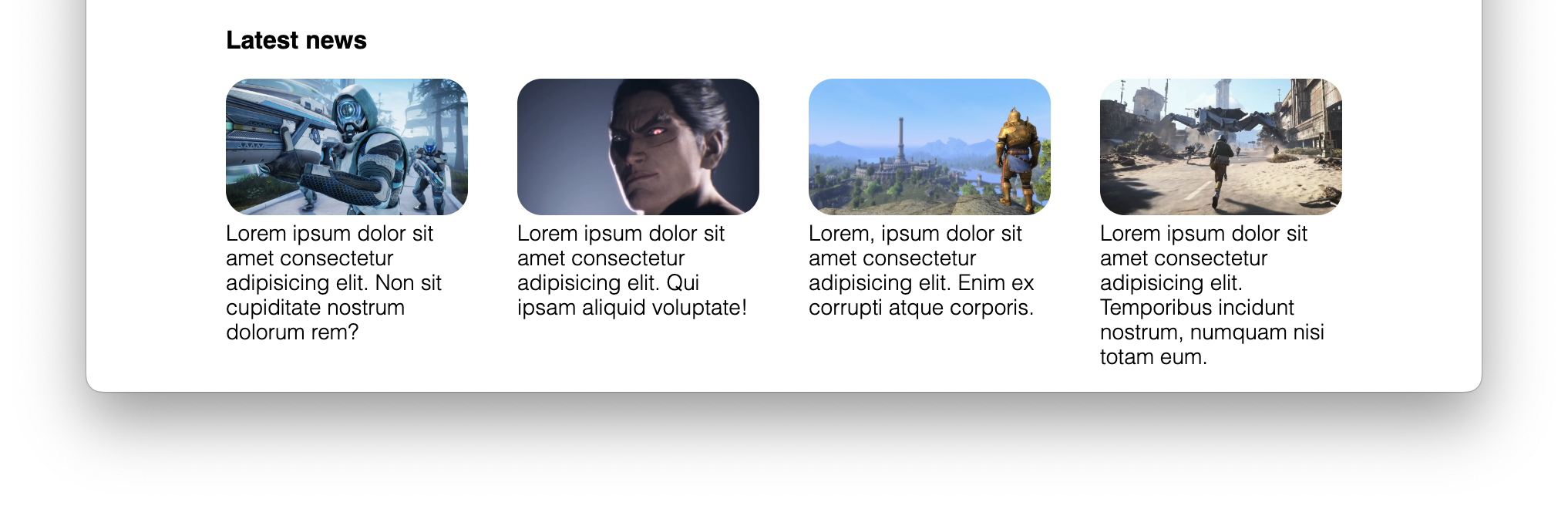
Looks much better, doesn't it? This completes most of the content of this page. There are some parts that I have deliberately omitted, such as the use of icons, the shadows of buttons. These topics will be covered in conjunction with design in the following chapters.
You have Completed Chapter 6
Fantastic work! You've completed the development of the project's 'Recent News' section, adding another layer of interactivity and visual appeal to your site.
Coming up next, we'll explore how to publish your website. This final step will make your site publicly accessible, allowing you to showcase your hard work to the world.