Week 1: Implementing the Hero Banner
This chapter focuses on creating an impactful Hero Banner section for your website. You'll learn advanced techniques in using the Flexbox layout, along with mastering relative and absolute positioning to craft a captivating and visually dynamic hero section.
In this chapter, you will learn
Implementing the Hero Banner
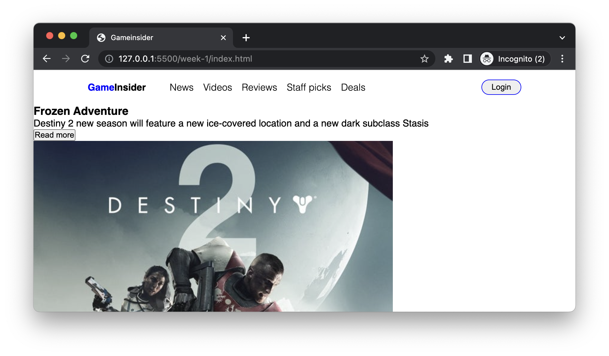
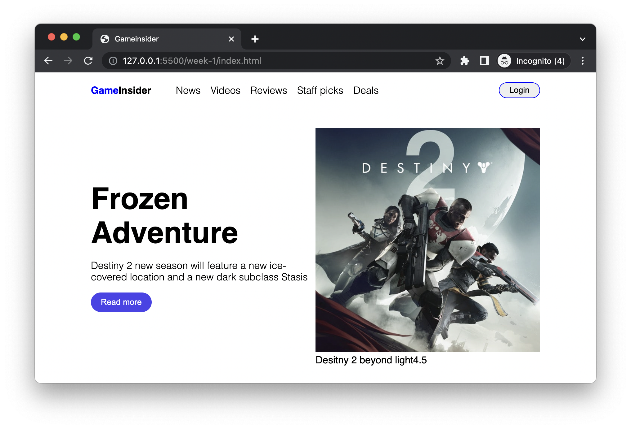
Next, we can look at the hero banner section. Almost everyone website has such a section that is spacial, usually with large fonts, eye-catching pictures, and a button (Call To Action) to guide users to action (like, click it).
According to the mockup, we can divide the entire area into left and right parts. The title and descriptive text are on the left, followed by a call-to-action button. The right side is a little more complicated, containing an image and some description and rating placed on top of the image.
As mentioned above, let's write the HTML content first. It is worth noting that when writing HTML, we need to assume that the page is usable without any CSS. The title should be readable, hyperlinks is clickable and can navigate users to the new address they need, etc.
<section class="hero-section">
  <section class="brief">
    <h1>Frozen Adventure</h1>
    <p>
      Destiny 2 new season will feature a new ice-covered location and a new
      dark subclass Stasis
    </p>
    <button class="button-secondary">Read more</button>
  </section>

  <section class="media">
    <div class="game-cover">
      <img src="assets/hero.jpeg" alt="destiny 2" />
      <p class="title">Desitny 2 beyond light<span class="rating">4.5</span></p>
    </div>
  </section>
</section>
Here you can use either a div or section as the container tag of the section. I usually prefer section as a container for content, and div as an auxiliary tag.
Also, don't use div unless necessary. Usually, though, the two are used interchangeably in many cases.
Before any styles, this part looks like this:
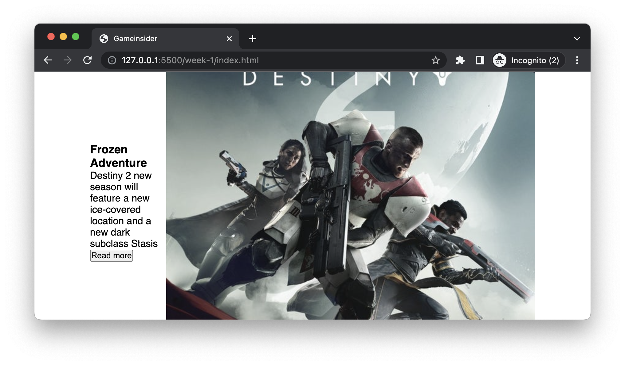
To make the two block-level elements brief and media line up horizontally, what method should we use? That's right, like the navbar, we can set the container hero-section to be a flex container:
.hero-section {
  width: 80%;
  margin: 2rem auto;
  display: flex;
  align-items: center;
}
Well, the horizontal arrangement is fine, but the width of the two parts seems to be uneven. The image part occupies more space, and the text is pushed to the left. We need them be half and half distributed:
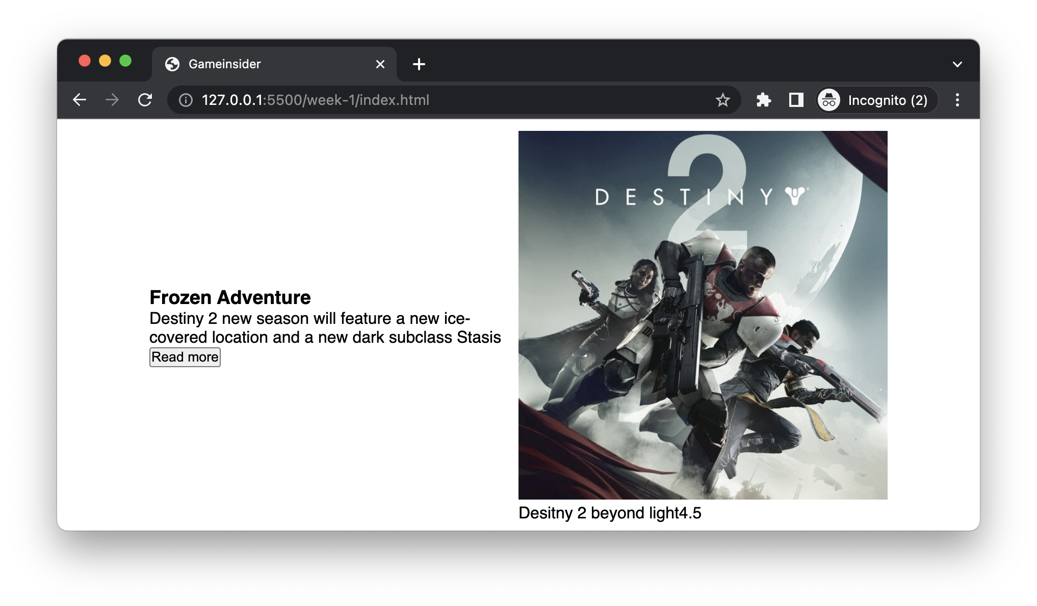
At this time, we need to use the flex:1 rule for both elements in the container and set the width of 100% for the image instead of the default width so that the image will fill the available width of its container (the .game-cover):
.hero-section > section {
  flex: 1;
}

.game-cover img {
  width: 100%;
}
Note there is a new CSS syntax here: >. This symbol represents the immediate child node of the selected .hero-section. Without this direct operator, .hero-section section would select all sections inside .hero-section, no matter how deep it is.
The flex:1 here needs some extra explanation too. This is a typical CSS abbreviation, and its full form is:
flex-grow: 1;
flex-shrink: 1;
flex-basis: 0%;
flex-grow is the growth factor, that is, in a flex container, how to allocate the remaining space to the element. It is only valid if all the elements themselves are smaller than the container size. flex-shrink refers to the shrink factor, that is, when the width of all flex elements exceeds the width of the container, in what proportion each element should be shrunk. flex-basis refers to the default size of flex elements.
Flex layout
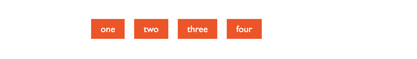
We can illustrate the relationship between these attributes through a concrete example.
<div class="container">
<div class="box">one</div>
<div class="box">two</div>
<div class="box">three</div>
<div class="box">four</div>
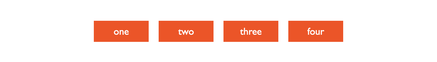
</div>In the beginning, we set container as a flex container, and their child nodes box are automatically flex elements. But since the length of each word is not the same, the arrangement of the four boxes is like this:
.container {
  display: flex;
  align-items: center;
  gap: 1rem;
}

.box {
}
This is because by default the CSS for flex elements is set to flex:0, i.e.:
flex-grow: 0;
flex-shrink: 1;
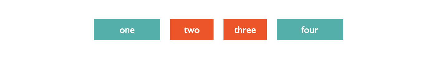
flex-basis: 0%;We set the flex-grow of all divs with box class to 1, which means they have the same growth factor if the container has enough space:
.box {
  flex-grow: 1;
  flex-shrink: 1;
  flex-basis: 0%;
}
At this point, they will fill the entire container and share the space evenly:
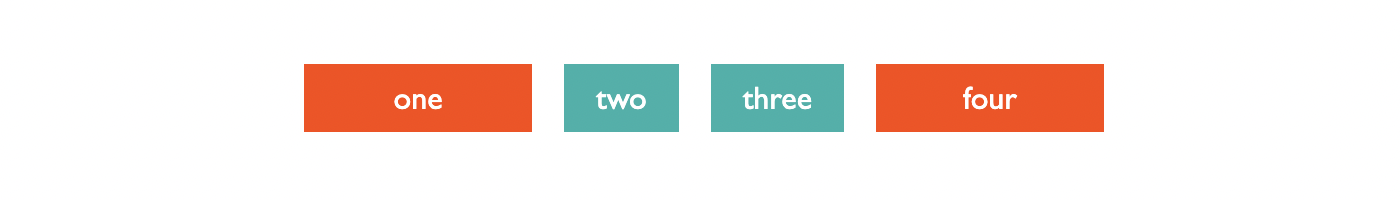
If we set different growth factor for some elements:
.box:nth-child(1) {
  background-color: lightseagreen;
  flex-grow: 2;
}

.box:nth-child(4) {
  flex-grow: 2;
  background-color: lightseagreen;
}
Then when the container space is sufficient, the first and fourth elements will grow faster than the other elements (as they have large flex-grow proportion).
flex-shrink is quite the opposite of flex-grow. When the width of the flex container is less than the sum of the widths of all flex items, flex-shrink defines the ratio by which each element shrinks.
.box {
  flex-grow: 1;
  flex-shrink: 1;
  flex-basis: 50%;
}

.box:nth-child(2) {
  background-color: lightseagreen;
  flex-shrink: 2;
}

.box:nth-child(3) {
  background-color: lightseagreen;
  flex-shrink: 2;
}
For example, in this example, we set flex-basis to 50%, that is, each flex element shrinks or stretches from 50% of the parent element. Obviously, because there are four elements in the container, the overall length exceeds the container, so flex-shrink takes effect, and the result is that the second and third elements shrink faster than the other two and are, therefore smaller:
Polishing the homepage banner
Well, our banner has a half and half layout now, and then we need to do some typography. Generally speaking, we can emphasise some elements through visual elements like different fonts, colours, etc., to make the subject more eye-catching and the page more balanced.
h1 {
  font-size: 48px;
  font-weight: bold;
}

.brief p {
  font-weight: lighter;
  margin: 16px 0;
}
For customising the button and the navigation bar, we used the colour picker to get the purple value from the mockup: #4A43EB.
.button-secondary {
  appearance: none;
  padding: 8px 16px;
  border-radius: 16px;
  border: none;
  background-color: #4a43eb;
  color: white;
}
We use appearance: none here to reset the browser's default style and then add rounded corners, background colour and font colour to it.
For the right side of the banner, we noticed that rating content overlaid on the image in the mockup. This effect of cascading of content requires a little explanation.
When the browser renders HTML, it arranges the elements in order, and there is no overlay (after all, overlay means occlusion, that is, some content cannot be seen). If we need some elements to to jump out of the arrangement process and free up the position that originally belonged to it, then we need to set the element's position to absolute.
This way, the element jumps out of the normal document flow and leaves the positioning to the developer. At this time, we can use top, left, bottom and right to control the absolute positioning of the element, the default coordinate origin of the upper left corner of the screen.
But most of the time, we don't want to take the upper left corner of the screen as the origin but a certain element. In CSS, we can set the position of an element to relative so that its child nodes will have their origin at the top left corner (instead of the screen top left corner).
In this example, we want to use the .game-over as a baseline and then place the description text on top of it:
.game-cover {
  position: relative;
}

.media .title {
  position: absolute;
  bottom: 16px;
  left: 16px;

  color: white;
  font-size: 14px;
  font-weight: lighter;
}

.media span.rating {
  margin-left: 8px;
}
Finally, we made a little adjustment to the corners of the image to make the implementation closer to the mockup:
.game-cover img {
  border-radius: 32px;
}
This results in an image with rounded corners, and a circle with a radius of 32 pixels:

Congratulations, we have completed the second major part of the page. Here we learned some details of flex layout to achieve an even distribution of elements in a flex container, and we also learned to use absolute positioning (position: absolute) and relative positioning (position: relative) to make elements Layer up to make it more visually pleasing.
You have Completed Chapter 5
Congratulations on completing the Hero Banner chapter! You've now crafted a stunning entry point for your website, capturing the essence of your content in a visually engaging way.
In the next chapter, we'll dive into the 'Recent News' section. Here, we'll leverage our Flexbox skills to organize multiple items effectively, enhancing the overall layout of our webpage.